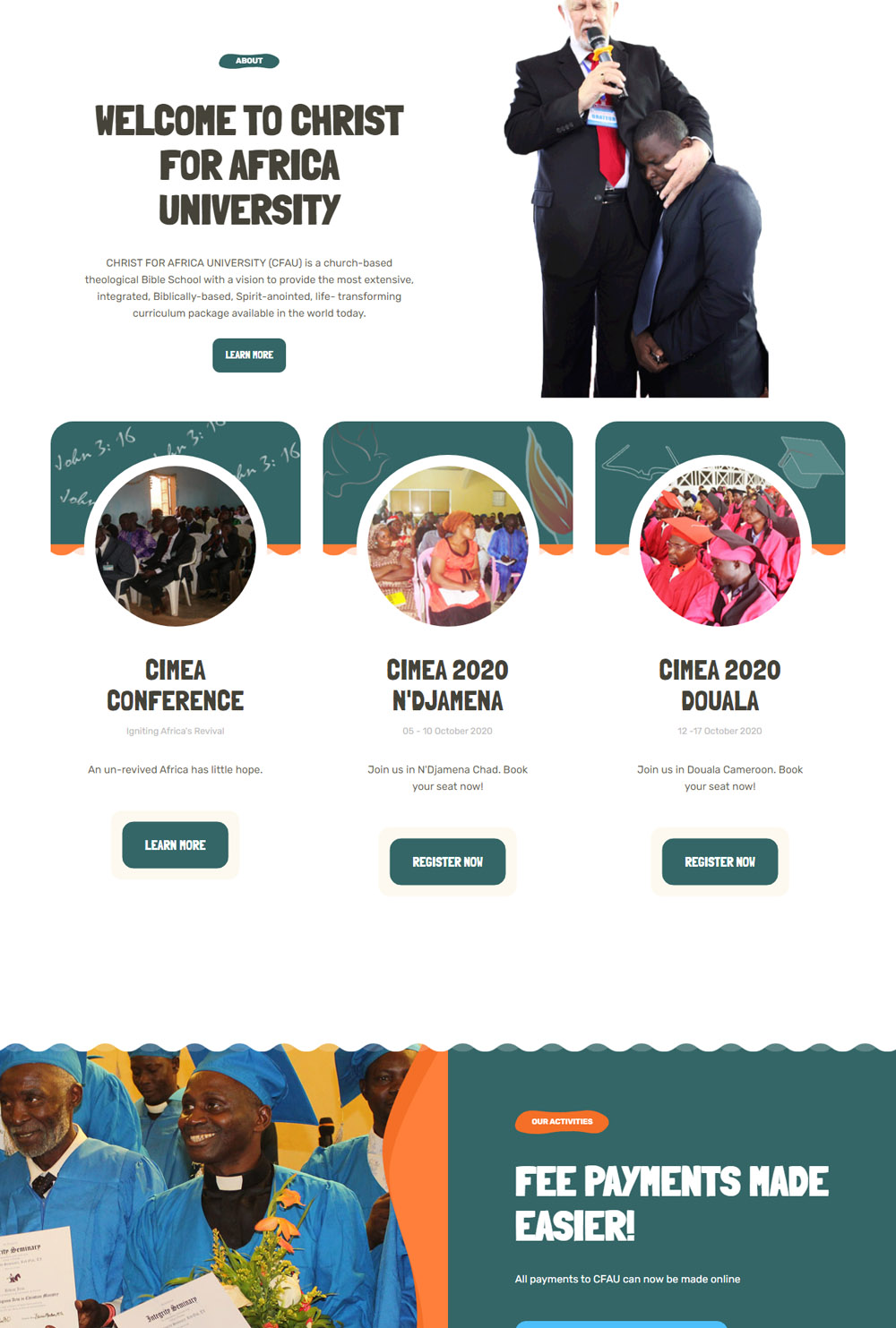
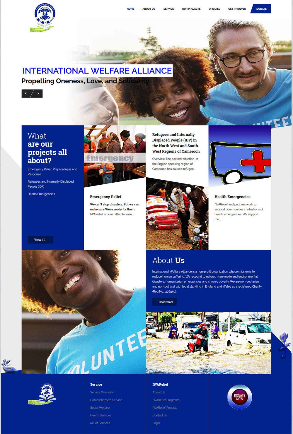

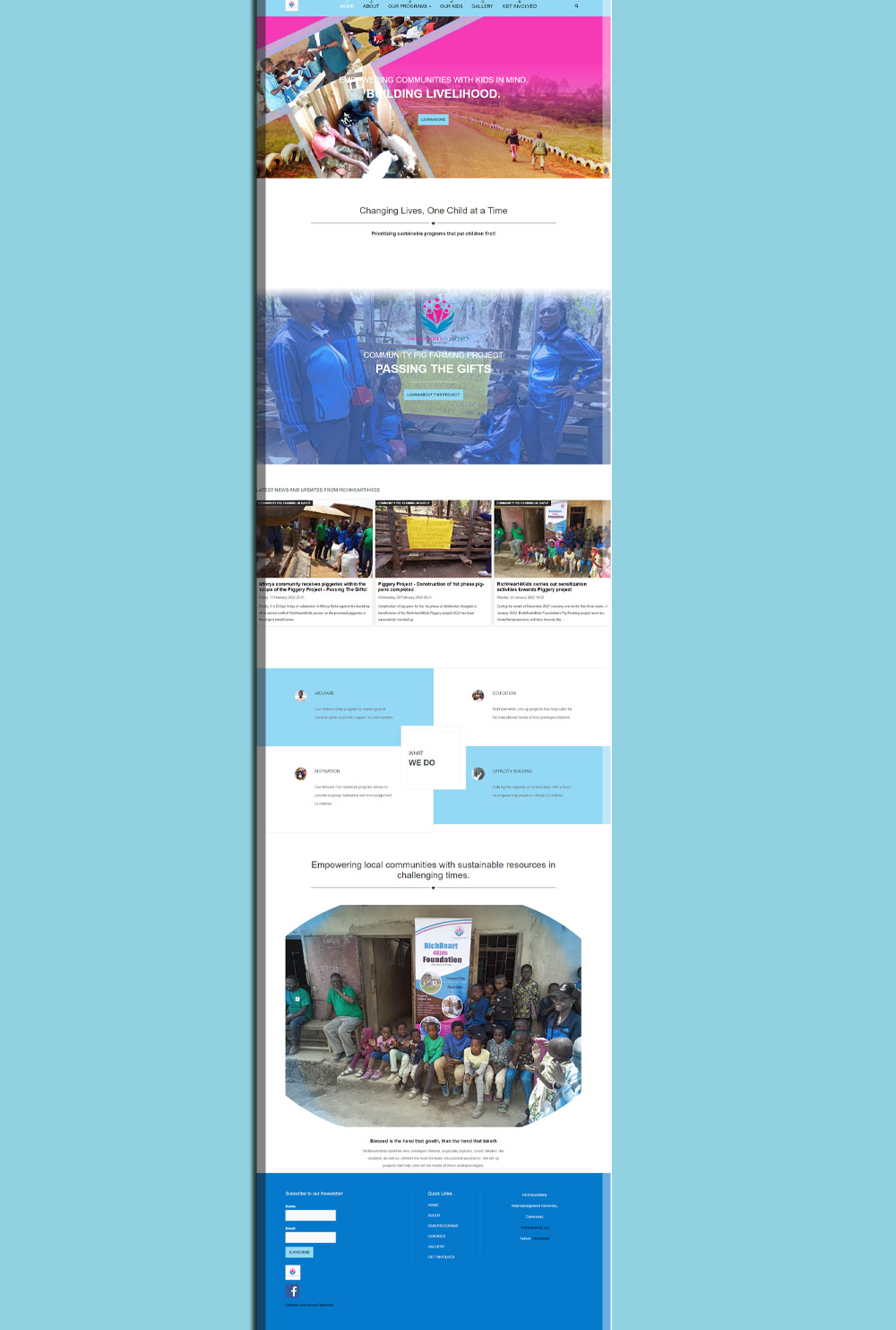
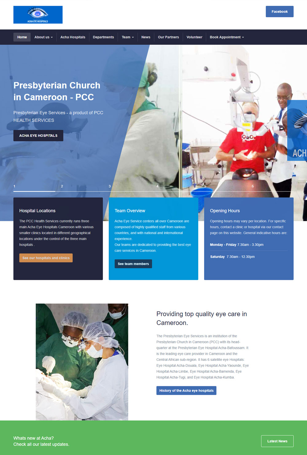
In today’s digital landscape, a mobile-friendly website is a must. With more people accessing websites through a variety of devices, from desktop computers to smartphones and tablets, it’s essential that your website provides a seamless experience across all screen sizes. At MCT, we specialize in creating responsive designs that automatically adjust to any device, ensuring that your website looks great, loads quickly, and functions perfectly, no matter how your visitors access it. A responsive website not only improves user engagement but also helps boost your SEO rankings, driving more traffic to your site and increasing your chances of success.
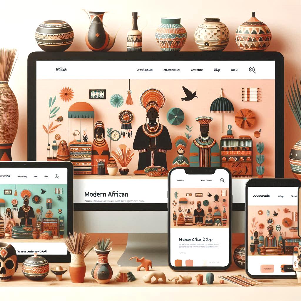
Responsive Design: Seamless User Experience Across All Devices
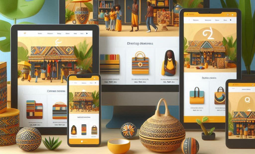
In today's fast-paced digital world, having a mobile-friendly website is no longer optional; it’s the standard. With increasing numbers of users accessing websites from a variety of devices—ranging from desktop computers to smartphones—ensuring that your website is responsive is essential to delivering a positive user experience.
At MCT, we understand that each device has unique screen sizes, and we prioritize creating websites that automatically adjust to fit any screen, whether it’s a large desktop monitor, a tablet, or a smartphone. Our responsive design ensures that your website will look great and function seamlessly across all devices, offering consistent performance and easy navigation no matter how your customers choose to browse.
Why Choose Responsive Design?
-
Improved User Experience: A responsive website provides a smooth, intuitive experience for users on any device. Whether they’re browsing on a desktop at home or checking your site from their phone while on the go, visitors will have a hassle-free experience. This can increase engagement and reduce bounce rates, encouraging visitors to stay longer on your site.
-
Boosted SEO Performance: Search engines like Google prioritize mobile-friendly websites in their rankings. With MCT’s responsive design, your website will not only look great but also be optimized for better visibility on search engines, helping you rank higher and attract more traffic.
-
Cost-Effective: Instead of developing a separate mobile website, responsive design ensures that you only need one site that adapts to different screen sizes. This can save you both time and money while ensuring your brand remains consistent across all platforms.
-
Future-Proof Design: As technology continues to evolve and new devices are introduced, a responsive website will adapt to any screen size, helping you stay ahead of the curve and ensuring your website remains functional on future devices.
At MCT, we specialize in designing and coding responsive websites that provide an optimal user experience while boosting your site’s performance in search engine rankings. Let us help you create a website that stands out, performs excellently, and delivers results, no matter what device your customers use.